

Behold The Scrollable, Zoomable 2D ‘Map’ Of The Internet
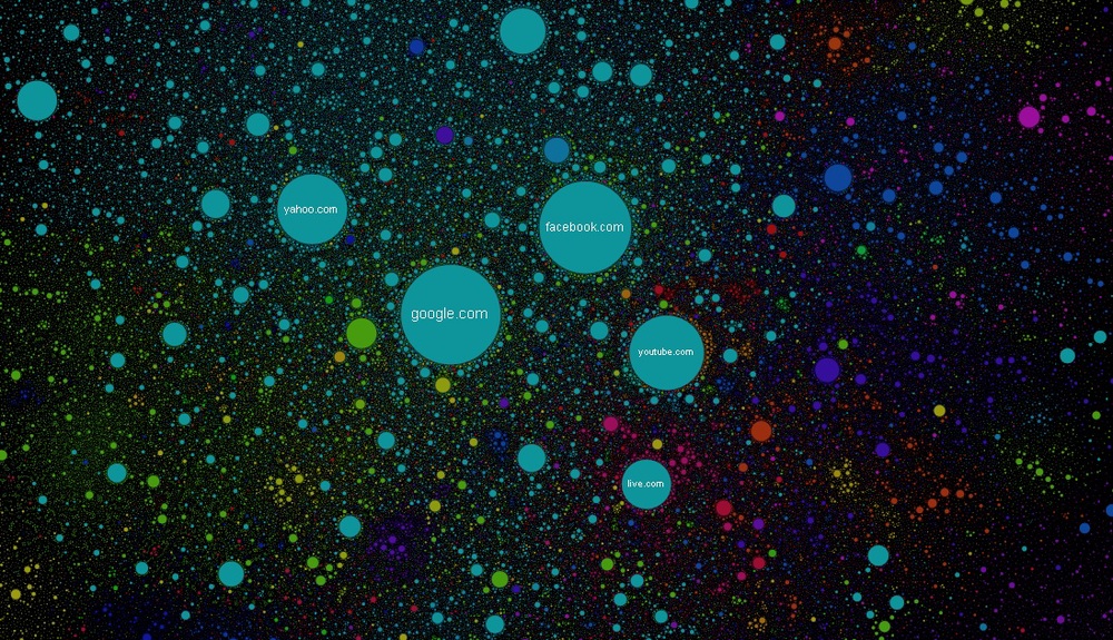
Though it might at first glance appear to be a colourfully-drawn visualisation of our solar system, the above image has in fact been created by Russian technology firm Positive Communications and is a fully-interactive 2D ‘map’ of the Internet. It’s one in which each circle is a unique website, and each ‘cluster’ of entities are site’s with a similar connection; be it videogames, technology, global news, or popular search results.
Currently drawing attention from Reddit, the map is a fascinating insight into the interconnections, scope and scale of the web, while also providing a quick-reference visualisation to understanding the biggest draws on the net. Noticeably and as you’d have suspected; Google, YouTube, Yahoo and Facebook dominate a significant chunk of the visual, key in representing not only the tremendous amount of visitors they attract on a daily basis but also the staggering amount of ‘relationships’ they have with other websites. As the project’s creators describe – and after a quick Google Translate from Russian to  English – “Transitions between the sites form a connection, the stronger the connection – the closer sites ‘want to’ sit [next to] one another.”
“To draw an analogy from classical physics, we can say that the site is charged beads, and a connection spring. The springs attract similar sites, but do not give the same charge and repel balls in contact sites, if there is no connection between them. Initially, all balls sites randomly scattered over the surface of the card. The springs are stretched, the repulsion energy is high - a system far from equilibrium. Then the sites are beginning to move under the influence of applied forces and after a while stopped - the attractive forces are equal to the forces of repulsion, the system reached a dynamic equilibrium. This state is shown on the map the Internet.”
Said to be ‘snapshot’ of the global network at the end of 2011, the diagram incorporates more than 350,000 websites from 196 different countries and all domain zones, taking in over 2 million connections between sites to create the thematic ‘clusters’ we see. What’s more, the circles themselves are colour-coded depending on the origin of the website – the large segment of blues represents the US for example. A search function even allows you to search by specific website (Reddit users have been thankful to see the site noticeably larger than 9GAG) for those of you keen on investigating the map yourself. Go on, investigate, there's a whole World Wide Web out there...
Richard Birkett
Source: Internet-Map