Comic Sans Project fights for typographical justice

So, haters of Comic Sans. Those who express anger at the 90s Microsoft typography. Those who are deeply aggrivated by the presence of an aesthetically failed version of comic book text. You have tried to extinguish the metaphorical flame os the sans serif font of the comical variety with your site of protest; but a movement is upon us that could change all of that: Comic Sans Project.
 The childish design ethic (intended) with no sophistication (maybe not so intended) and used by many designers in the mid 90s to downright terrible effect (just funny) has made it the butt-end of jokes amongst many graphic artists. You rarely see it anymore because, let's be honest, it does look pretty subpar isolated as a font, and rightfully doesn't deserve a place on any particular textual stage of a website.
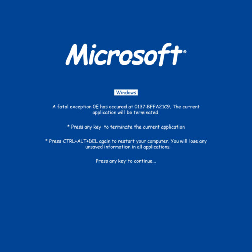
That hasn't stopped French designers Thomas Blanc and Florian Amoneau from giving it a go, generating quite a following in the process via their Tumblr, simply called the Comic Sans Project. It's quite a challenge to the norms of what has been before, with just one simple question asked: What if a selection of the world's renowned logos used Comic Sans?
The strapline makes the conquest sound like a mix between the 99% (#Occupy) and a strong hint of Anonymous:
WE ARE THE COMIC SANS DEFENDERS. WE FEAR NO FONTS AND WE WILL MAKE THE WHOLE WORLD COMIC SANS.
 As you've seen from a couple of the logo results, in some situations it doesn't seem to fit, such as the Chanel logo. However, The Walt Disney pictures logo? The Microsoft blue-screen? This selection have awoken an idea: maybe Comic Sans isn't only for trolling purposes, or for satirical douches who have no idea of the history of the font but make jokes anyway (that's right, we're onto you). The simple design, the composure of the characters within these iconic logos, it all brings back a surreal appreciation for the font. The typography doesn't work in an isolated context; but in the presence of logo imagery, we're almost tempted to say it looks good.
It's cool to love Comic Sans again. Look out for more transformed logos soon via the source link below.
Source: Comic Sans Project
