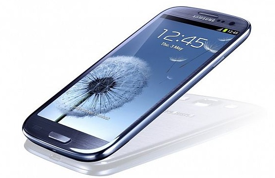
Love And Hate Of The Samsung Galaxy S3

So the Samsung Galaxy S3 announcement has come and gone in a daze of applause, orchestral accompaniment and Suzi Perry. Many of the rumours and speculation we collected were correct, the stage was set for the 'biggest smartphone announcement of the year,' and we got a phone which is primed to be a rather huge success in the high-end Android device market.
But some of us aren't buying into this new 'nature' visage, seeing the new Galaxy, its design cues and software implementations as quite the disappointment. Is this the final, rather laughable nail in the coffin of originality? Or is this to be the best smartphone of the year? Two editors debate.
Richard Birkett (Editor-At-Large) : "There Is No Better Designer Than Nature"
So it’s finally been uncovered. After what has seemed an eternity of rumour, a fair batch of predictions from Wall Street analysts and a shed-load of leaks, Samsung has let the world in to ‘meet the new Galaxy’. It promises to be the next-next poster boy for Google’s Android platform and threatens to usurp Apple from its throne while it’s at it. With the iPhone 5 announcement still months away (you’d better expect great things), the S3 has a terrific chance in clawing back kind of sales the iPhone 4S has enjoyed in the time since its arrival last October. On this basis, it’ll put up one hell of a fight: the Samsung Galaxy S3 looks positively stunning.
 “Designed by humans and inspired by nature” might well be a tad over-blown for the design of a smart-phone – what with those who have had their hands on the S3 already bemoaning the fact that Samsung has favoured a plasticky finish over a top-grade build, once again – but the fact is that the S3 is one of the best looking phones soon to be at market. The 4.8-inch Super AMOLED display (720 x 1,280) is the obvious stand-out feature and one that looks wholly at home embedded into the smooth curvature of the shell. The whole 'nature' publicity drive might be somewhat placed by Samsung, but it doesn't take much to understand the sentiment: the S3 is a natural beauty, unafraid to push continuous curves and non-linear lines ahead of hard-edged corners and mirror-image aesthetics.
Samsung president JK Shin went as far to say that the S3’s final design has been heavily “inspired by water, wind, leaves and pebbles” and one that works “seamlessly” side-by-side each of our frantic daily lives. And that means the Galaxy S3 packs a sizeable number of fancy features under its skin to make using the phone as user-friendly, painless and efficient as possible. The front-facing camera and some Orwellian software trickery allows the S3 to recognise when you're looking at the phone and maintaining its brightness so long as your eyes stare at it (no dimming screen here), and will also turn itself off automatically when you place the device by your side.
Meanwhile, 'Smart alert' nudges you to notifications through subtle vibrations; 'S Beam' allows S3 users to transfer photos, contacts, videos, documents between them with consummate ease simply be putting the backs the phones together; placing the S3 by your ear when texting someone will instantly call the very same person; 'Social tag' automatically detects those in your pictures in order to create more personal contact lists and makes sharing in our socially-conscious lives even easier. Seamless? 'Intuitive' sounds a more perfect fit.
An intelligent, devilishly-devious assistant by the name of ‘Siri’ might have taken some of the limelight away from the S3’s S Voice software, but the inclusion of some form of voice recognition is understandable given the continued success of the iPhone 4S. Capable of understanding eight languages, the app is but one upgrade from its excellent predecessor that is putting more power into the hands (scratch that, voice) of the user. S3 users will now be able to retrieve the latest weather reports, make diary reminders and ask the voice-in-the-phone some unwieldy question in our pursuit of knowledge - ‘Answer to the universe, life and everything’, ‘How much wood could a woodchuck chuck if a woodchuck could chuck wood?’ – with just a few choice words and our dulcet tones to aid us along the way. It might not make users gasp in delight as the assistant turns vocal instructions into actions like Siri did months ago, but Samsung would have been daft to not include it.
Naysayers will try and write off the S3 for a lack of innovation, or choose to demean Samsung's cesspit of creativity for not thinking outside the box in terms of either design or, for the most part, functionality. But to do so is to criticise a large sector of smartphone manufacturers at the same time. Just take one look at the iPhone 4S and tell me it isn't a worthless upgrade from its predecessor, or likewise the new iPad from the iPad 2. At a time where yearly releases are part and parcel of the business, at least the S3 can offer its audience implemented features that are genuinely worthwhile. Famed British fashion designer Alexander Mcqueen once said, “There is no better designer than nature.” How right he was.
Jason England (Editor-In-Chief) : "Delusions Of Nature-Influenced Grandeur"
In June 2009, Samsung rekindled their relevancy in the mobile phone market for the first time, in my opinion, since the popularity of their excellently designed flip phones of the early 2000s. Its strategy of continually fighting the hardware spec list battle for superiority had paid off, and they became more than just another Android OEM. This continued with the Galaxy S II, and regardless of the bane-of-existence that is the TouchWiz skin, it became a primary alternative to the iPhone.
It was quantity over quality, and Samsung upheld this reputation well; but this third iteration is different.
They say it's 'designed for humans:' this has proven just how little the company understands humans.
 The Galaxy S3 is supposed to represent a break from the norm, something out of the ordinary to not become 'one of the sheep.' Instead we received a set of poorly implemented ideas and concepts in a substandard looking device, with delusions of nature-influenced grandeur.
Question: how backwards in logic is the idea of a nature-influenced phone, in the face of how environmentally unfriendly and unnatural the origin of the phone will probably be?
Hold the device in your hand and you'll see the odd combination of a phone that's been designed very safely, as probably approved by lawyers for the market, and is also rather hideous, from the choice of colours to the 'blob' connotations of its architecture. It feels like both pure uncreativity and a complete lack of knowledge about industrial design. Infact, with the nature inspiration, it feels as if they've completely thrown industrial out the window. And we like industrial ideals: it makes for some rather logically beautiful products (hello HTC One X).
A signature lockscreen greets you, emulating the user running their finger through water. Audio feedback for interaction throughout the UI represents the sound of water and nature, being more akin to the soothing sounds of someone urinating. Upon immediately experiencing something like this, not only did the lady demo-ing the device call it 'bizarre;' but it's slightly uncomforting. And this idea of needlessly lapping on form to further disguise function is something that resonates throughout the OS, alongside a somewhat lacking sense of progress.
After the repeated legal equivalent to a tug of war match over toys with Apple, they still had to do what is quite frankly a Siri rip-off. I'm not taking the position of a fanboy, nor am I an expert in law; but that word-for-word request for weather details and the near-identical animation and visual design of the application in general has to hit a little too close to the Cupertino voice-assistant counterpart. All-Share Play, a.k.a Air Play. The different 'inspired ideas' put forward connotations of a company trying to confuse consumers shopping for a new phone, and blur the lines between itself and the iPhone. Talk about not being 'one of the sheep.'
As you may have deduced from the aforementioned lockscreen comment, TouchWiz for all its new modifications, is still a rather terrible looking UI. And when a large percentage has heralded stock Ice  Cream Sandwich with praise, you have to think the hardware manufacturer behind the Galaxy Nexus would've at least strongly considered the option, in the face of sheer criticism.
I could continue my countless criticisms of the likes of the S-Pebble (an MP3 player...for your phone...), the camera software being a straight copy of HTC's Image Sense in the One series, that damn elongated home button; but the conclusion is simply this. Samsung have shown a rather disappointing hand for all the promotion they have placed into the Galaxy S3. They have placed faith and research into the wrong areas, and created a phone which demonstrates their lack of understanding of what the average user really wants from their device.
But it's got a quad-core processor, so the benchmark's can make you feel superior about something at least, and they'll be selling them in pop-up cubes a'la Apple Store. Don't be a sheep by being one of the sheep.

