Google Nexus 7 Review
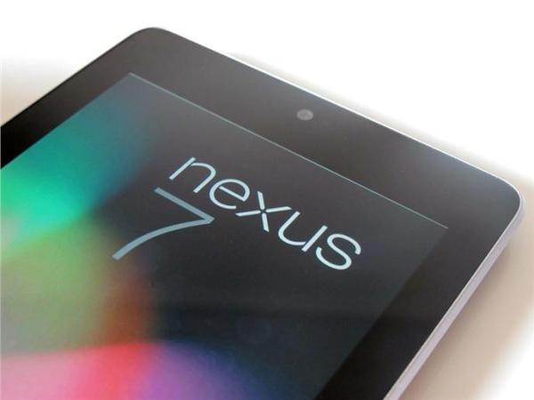
Let's be honest, Android tablets have been a sort of sketchy affair. A mish-mash of hardware form factors and disappointing user experiences. But that is about to change.
"7-inch tablets are going to be dead on arrival," the late Steve Jobs proclaimed in October 2010. Google, myself and probably lots of others would beg to differ with the Nexus 7.
The next in the line of products that present the metaphorical middle finger to OEMs and their depreciation of the stock Android experience through needless clutter and skinning, the Nexus 7 redefines your pre-conceptions of what makes a budget tablet. This software and hardware love affair between Google and Asus has produced something with the real potential to kickstart the campaign for Android tablets as a whole.
Video Review
External Hardware
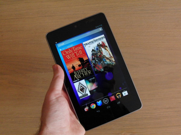
You remove the tablet from the packaging, and immediately realise £159 has bought you an impressively built and styled piece of hardware. On the face of it, it's a pretty standard affair: glossy display, black bezel and a silver frame surround, pretty much fitting in with the current trend of product design. The back is covered in a soft-touch material with dimples in, feeling sort of like the kind of material used on car steering wheels. It gives an unmistakable feeling of premium quality, as it imitates the feeling of leather. Great to see this much attention paid to the back as well as the front.
Held in portrait, the micro USB and standard audio jack are on the bottom, the power/lock and volume keys on the right, and a set of connecting dots to be linked to a dock on the left edge. A 1.2 megapixel front-facing camera is present on the upper bezel. There's no rear camera; but anyone who uses a tablet to take photographs is, quite frankly, not worthy of the tablet they've been given, so it's no big loss.
The form factor feels good in the hand, with a combination of the unique material texture on the back, the weight of 830 grams, and the un-ordinarily large bezel surrounding the front panel making for an un-intrusive and, most importantly, comfortable user experience. Then upon thinking of the price of this device, you realise just how much value for money you received with a product Google and Asus are essentially making a loss on.
Internal Hardware
 The Nexus 7 comes armed with a Tegra 3 quad core processor clocked at 1.15 Ghz (or 1.3 Ghz if it's running on a single core), 8GB or 16GB of storage (the latter costing £199), a 1280x800 LCD display with IPS technology, and all the usual suspects: Bluetooth 4.0, Wi-Fi 802.11b/g/n, GPS chip, NFC, gyroscope, compass, and accelerometer.
This all builds up to a tablet that fits very comfortably into whatever needs and wants you have for a tablet computer. Things will look crisp and clear, with good colour on the screen, and perform effectively with the impressively fast processor. You won't struggle with 3D gaming or HD movie playback. Quick note: if you have a device with an AMOLED display (e.g. Galaxy Nexus), then there's a very likely chance you'll see the colours on the Nexus 7 as rather washed out. While this maybe true in the grand scheme of things, I'd say it's because of the over-saturation of colours you get from the technology. The colours are more 'true-to-life' on the Nexus 7.
Limitations would be the inability to expand storage via a Micro SD card slot. The lack of 3G and 4G means your home library can't be accessed anywhere other than a wi-fi connection, meaning that if you do have an expansive media collection, you're going to have to get picky. The speaker along the bottom on the back of the Nexus 7 provides ample sound; but as with all products in this class, I'd recommend earphones all the way.
Surprisingly, the battery life on the Nexus 7 is brilliant. In our tests, it achieved 9 hours wi-fi browsing, 4 hours gaming and 10 hours of video, hitting the sweet spot of not making the user feel concerned about battery life.
Software
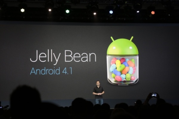
As this is a product to wear the "Nexus" moniker with pride, it has the pleasure to introduce us all to the latest version of Android: 4.1 JellyBean. On the face of it, not much has changed visually. The same user workflows are in place, from the multitasking menu to the use of Roboto typography throughout. Instead, Google have opted to make more minute tweaks and refinements to make a more positive impact upon the OS.
'Project Butter' makes a big impact upon the speed of the software and the eradication of lag throughout the user experience. Historically, I have always felt that Android has felt slightly lacking in terms of touch responsiveness and performance. With the vastly increased framerate and improved finger tracking technology that this project introduces, I can safely say these doubts are no more. It stutters extremely rarely; but then again so does iOS and it's all water under the bridge in terms of the slightly euphoric feeling of rapidly performing tasks.
Widgets will now either automatically resize, or icons on the home screen will move to make room for them. The once annoying process of trial and elimination in terms of establishing room for aforementioned widgets is  no more; a really helpful little tweak. A weird change, however, is the homescreen always being portrait. It just makes no sense, especially since tablets since Honeycomb have utilised a landscape orientation as well, that Google would opt against this. Third party options are available though, so not much of a gripe, just an odd curiosity.
Chrome is now the standard browser on JellyBean (Yes!) and Flash has now been removed from the Android platform. So while Steve Jobs looks down on us from the heavens (or up, depending upon your own personal opinion of him), you can be sure of a lightning quick web browsing experience, with next to no stutter or lag whatsoever.
The keyboard is abit of a catch-22. If this was available back in my days of being a student, I'd have been really tempted to invest in a month's worth of Heron's Frozen Food's cheapest and buy a Nexus 7. For notemaking in lectures, it would make a lot of sense...granted a paper pad and pen would make more sense; but replacing the common sense items has always been a byproduct of technology. The auto-correct has been improved for better efficiency. But my problem came with the size of the keyboard in the hand. I found it a strain to type on in like a smartphone in portrait, and cramped to type on in landscape like you would on most 10 inch tablets (or computers). It gets really uncomfortable after a while; but something like this is really down to individual preference. Just that for me it wasn't a good fit (that's what she said).
A key feature is Google Now: what people are calling ‘Android’s Siri competitor’ but something I see as more than that. It presents relevant information based on your search history and location in a series of cards as and when you need them. Sure it answers the bog standard questions you'd put to any voice assistant ("Do I need an umbrella?"), and the system understands even my ridiculous lisp remarkably well. But the intentions of the service through this card system are to be much more of a personal assistant than an AI you can have a conversation with and ask to set reminders. It’s got future potential, as the breadth of the service is rather  limited; but it’s a nice way to tie in all of Google’s products together.
Google have worked hard on the Play store to turn it into a strong media content ecosystem, with plenty of incentives dotted throughout the OS to tempt you into buying. A whole array of movies, music, books and apps are available for your delectation. And just in case you forget that (God forbid anyone who does...), two widgets will recommend apps and pieces of media based upon your previous purchase history.
The one issue that has cursed Android tablets is the amount of apps optimized for the larger screens. If you have tried the Twitter app on a 10-inch screen, you'll know what I mean. As the resolution is just too large for the apps optimised specifically for smartphone displays, this would leave for a lot of hugs gaps and a generally ugly user experience. The form factor of the Nexus 7 has gone some way to combat this. Apps in this category look and feel better to use on this 'middle ground' display size. If it was intentional, then Google's pulled off quite a brilliant move to mask the key falt of the OS on a tablet. However, stick it next to the delightful experience of something coded responsively (hi Google+), you can really tell the vast difference and improvement.
Conclusion
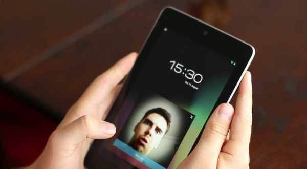
Overall, gripes about the OS and keyboard size due to my hands aside, this is a fantastic premium tablet, which is made even better by that low price point. The budget tablet market has well and truly been blown out the water, so if you were looking for one, you will be putting yourself to shame if you went for any of the other cheap tat in the low end market over this. It would have been great to see some sort of 3G enabled Nexus 7 in the future, for those of us who spend most of our time moving about away from our home wi-fi networks. And I think the local storage options maybe too constricting for some people, especially without SD card expansion. But on the whole, if you’re out in the market for a tablet, from the cheapest of cheap to the top of the range iPad, it's certainly worth giving this a look and asking if the excess of money on the latter is really worth it. 9/10

