'Google Time' Smart Watch Concept Presents Bright Future Of Wearable Tech

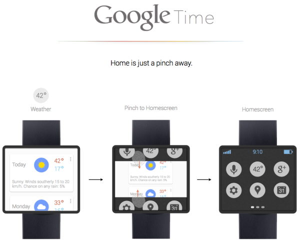
User Interface designer Adrian Maciburko has created a concept dubbed 'Google Time.' As the idea of wearable computing rapidly becomes a technological trend in 2013, this shows a really nice and simple take on the smart watch, using Google's latest design language.
 Using an easy-to-use blend of voice and touch, Adrian incorporates some key use functionalities without overbearing use onto the small screen. As it will be virtually impossible to translate all smartphone functions onto a watch, interface and app choices have been made to keep the design as unintrusive as a watch with enhanced capabilities could be.
Example, the homescreen is secondary to Google Now. While many are not using the service for its voice operation, the idea of personalised notifications sent to your watch throughout the day makes it an ideal fit. A selection of quick gestures make for rapid navigation around the watch, and he experiments with both a square and circular face.
Ever since Steve Jobs made a quip about the 2012 iPod Nano being turned into a wristwatch, the concept has been toyed with ever since. This is one of the better implementations I've seen, taking into account real world use and becoming as much of a background device as a watch should be. The market has shown a demand for it, and Google should really think about something like this alongside Glass.
Source: Adrian Maciburko
Jason England

