Why The Original Shadow Of The Colossus Is Better Than The Remake - Emotion Engineer Twitch Stream
Another Wednesday, another Twitch instalment of Emotion Engineer – the only channel dedicated to the PlayStation 2. On this episode, I will be showing just why the original Shadow of the Colossus is better than the remake.
Watch the stream LIVE below at 5 PM GMT and subscribe if you enjoy! Scroll down for my full piece on why the original > remake.
First of all, before the commenters start turning on me, let me be clear… I am not saying Bluepoint Games’ reboot of Fumito Ueda’s 2005 masterpiece is a bad game. I love seeing games from my younger years remade for new generations to enjoy!
The fact they have remained faithful to the original formula – simply giving the game a new lick of paint and leaving the gameplay elements well alone – is a testament to just how far beyond its time the original was.
But two reviews summed it up in a way that eloquently echoes my feelings on the issue. The remake is a perfect cover song, with a “slightly different tune.” And to compare the two versions is like “comparing paintings of the same object.”
This remake is firmly placed in the realism period – feeling tangible, lived in and containing characters reminiscent of 1980s fantasy epics like The Neverending Story. Meanwhile, the original was designed through the lens of impressionism – using light to their advantage in the constraints of PlayStation 2’s graphical capability. Colossi loomed over you as daunting silhouettes, textures were drawn as if by brushstroke, the whole universe looked fresh off a fantastical canvas.
I’m all for hyper-realistic graphics, as the TVs we play games on have matched the fidelity required to pull them off. But to me, style has always superseded substance and it is through these next few weeks of Emotion Engineer that I hope to show you just why the original looks and feels better than the remake.
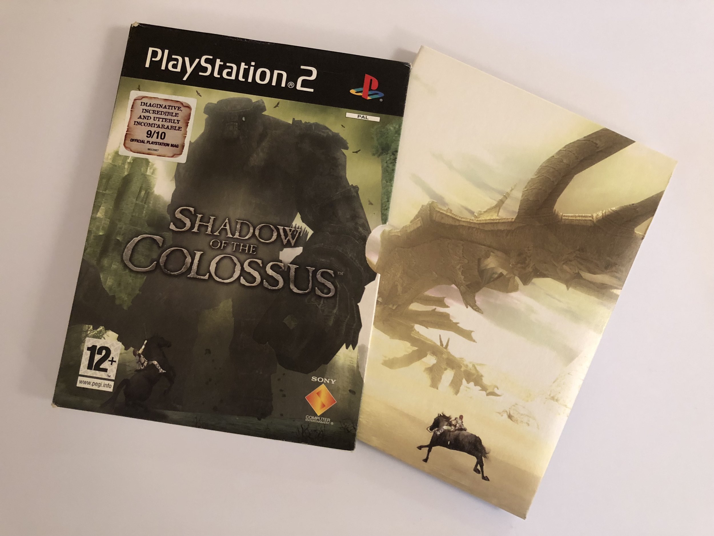
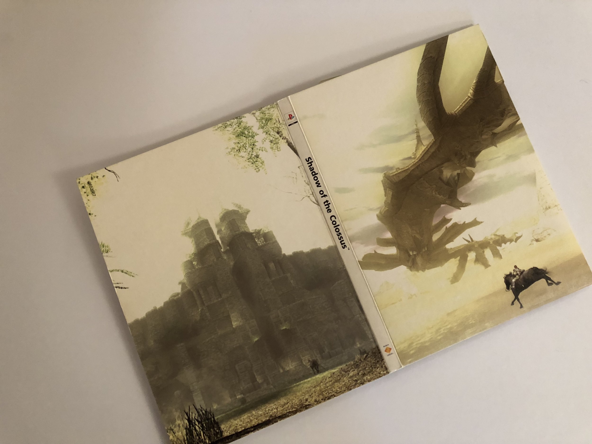
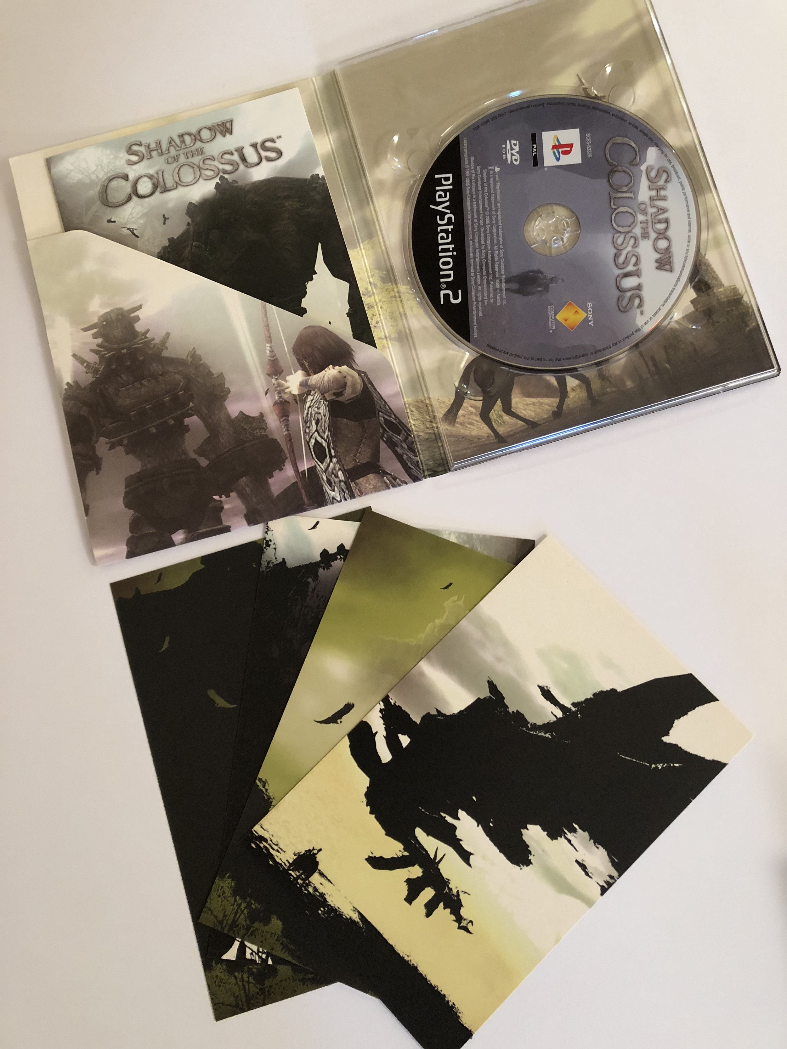
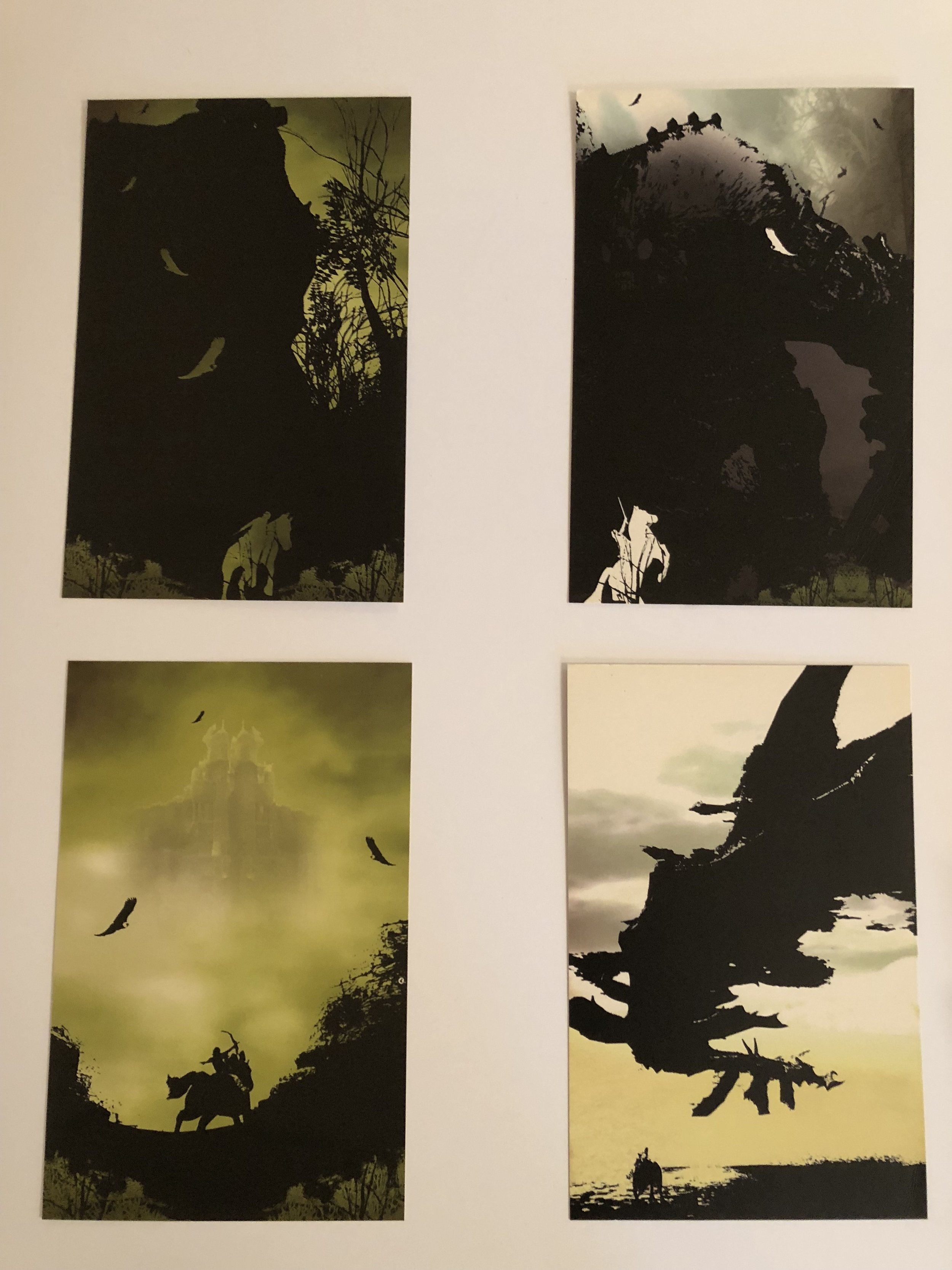
Plus, the box art… I’ve always had a hatred for recent generations of video game box art, lazily slapping the lead character and antagonist onto a case with zero artistic value. PS2’s Shadow of The Colossus was one of the last great artistic ventures into box art (and an actual game booklet too). Just look below and admire.
And as you know, I love dogs. Tweet me your dog pictures to feature on the stream, and as always, I dedicate this to a good boi. This week – Anbu.


