HP rebranding proposition explained in pictures and video

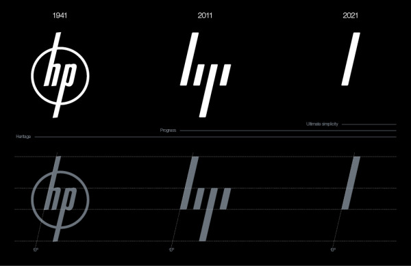
Three years have passed since Moving Brands were hired by HP to redesign the brand imagery through a radical overhaul, and rediscover the identity of the company through improved visual output.
This is the first time we've been able to see the complete proposition in public, and it's quite a transformation. The company have departed from the circlular design and opted instead for a pretty minimalist four-line motif; but they haven't rid themselves of the slant in the lettering.

